Skeleton Grid, Fluid

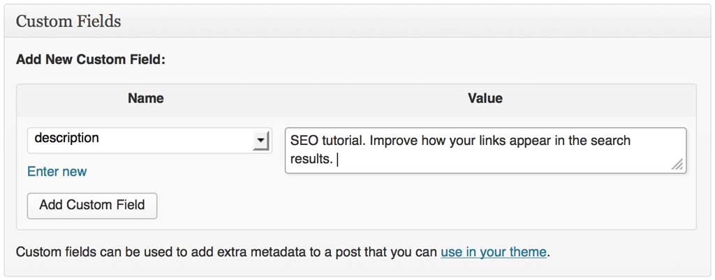
Skeleton Grid translated into fluid layout.

@media only screen and (min-width: 1200px) {
 
.container							{ width: 100%;}
.container .column,
.container .columns					{ margin-left: 1.2%; margin-right: 1.2%px; }
.column.alpha, .columns.alpha		{ margin-left: 0; margin-right: 1.2%; }
.column.omega, .columns.omega		{ margin-right: 0; margin-left: 1.2%; }
.column.alpha.omega, 
.columns.alpha.omega					{ margin-left: 0; margin-right: 0}
 
.container .one.column 				{ width: 4.58333%; }
.container .two.columns 				{ width: 10.8333%; }
.container .three.columns 			{ width: 17.1%; }
.container .four.columns				{ width: 23.333%; }
.container .five.columns				{ width: 29.583%; }
.container .six.columns 				{ width: 35.833%; }
.container .seven.columns 			{ width: 42.01%; }
.container .eight.columns 			{ width: 48.333%; }
.container .nine.columns				{ width: 54.583%; }
.container .ten.columns 				{ width: 60.833%; }
.container .eleven.columns 			{ width: 67.1%; }
.container .twelve.columns 			{ width: 73.333%; }
.container .thirteen.columns 		{ width: 79.583%; }
.container .fourteen.columns 		{ width: 85.833%; }
.container .fifteen.columns 			{ width: 91.1%; }
.container .sixteen.columns 			{ width: 98.333%; }
 
.container .one-third.column 		{ width: 31.666%; }
.container .two-thirds.column 		{ width: 65%; }
 
/* Offsets */
.container .offset-by-one 			{ padding-left: 6.25%; }
.container .offset-by-two 			{ padding-left: 12.5%; }
.container .offset-by-three 			{ padding-left: 25%; }
.container .offset-by-four 			{ padding-left: 50%; }
.container .offset-by-five 			{ padding-left: 31.25%; }
.container .offset-by-six 			{ padding-left: 37.5%; }
.container .offset-by-seven 			{ padding-left: 43.75%; }
.container .offset-by-eight 			{ padding-left: 50%; }
.container .offset-by-nine 			{ padding-left: 56.25%; }
.container .offset-by-ten 			{ padding-left: 62.5%; }
.container .offset-by-eleven 		{ padding-left: 68.75%; }
.container .offset-by-twelve 		{ padding-left: 75%; }
.container .offset-by-thirteen 		{ padding-left: 81.25%; }
.container .offset-by-fourteen 		{ padding-left: 87.5%; }
.container .offset-by-fifteen 		{ padding-left: 93.75%; }
 
}

Better SEO: Custom Meta Description for Every WordPress Post, without Plugins

Search engines use page’s meta description in search result snippets to provide more information about the content of the page and it’s relevance to the user’s query. Google recommend that you include a unique, descriptive meta description for each page. They sensibly prefer it to an auto-generated one, cobbled together out of words, phrases and chunks of sentences found throughout the page or entire site.

WordPress does not provide meta description out-of-the-box. While there are some excellent plugins that can greatly improve your site’s search engine friendliness, good practice is to keep the number of plugins to a minimum, especially when DIY solution is an easy one, as in this case.

To add the custom meta description feature to our site, we’ll make use of custom fields: the ability to include any number of key/value pairs with a post and then use them as needed.

So, let’s create a key/value pair by typing it into the form as shown bellow. The name of my key will be description, and for its value I’ll type in the meta description I want to use for my post:

wp-custom-field-meta-description-visual-culture.me

Now that we have the content of our new meta description for our post, all that’s let to do is call our meta key up and use it’s value in our page. Place the following code within the <head> tag in your template’s header.php file:

<meta name="description" content="<?php
	get_post_meta($post->ID, 'description', true);
?>" />

This is it. The HTML code for your page will now look like this:

wp-head-tag-code-visualculture-me

And this is how the link will appear in Google search results:

wp-google-snippet-visualculture-me

Event Espresso Confirmation Email Settings

Event Espresso allows setting and customization of the outgoing registration confirmation email message in three different ways:

1. Through the general default email template,

2. Through saved custom email templates, and

3. In the settings page of each individual event.

1. General Settings page

On the plugins General Settings page scroll to Default email template box. The content of the box is a template for a default confirmation email that will be sent out unless the settings are overridden manually for the individual event (via options 2. or 3.).

Notice the example content in the email box. It consists of plain text as well as bits of instructions for the program, called shortcodes:

Thank You [fname] [lname]

Shortcodes will be replaced by the actual information from the registration form, so in the confirmation email in place of [fname] and [lname] customer’s real name will be used instead.

Edit the general template if one confirmation email format is sufficient for all your events, e.g., if you offer just one kind of events, say, a photography class.

If you find you will need more then one email templates for different types of events, look at:

2. Custom templates

Email Manager, found in Event Espresso General Settings menu, allows for creation of any number of confirmation email templates that can be saved and latter assigned to individual events as needed.

On the Email Manager page click on Add New Mail and fill out the form. The Email Name is the name of your template for your reference and you can be descriptive here as it’s useful. In the next field, Email Subject Line, enter the subject of the confirmation email as it will appear in your customer’s mailbox. Email Text field is for the body of your message. Use plain text and shortcodes as in 1. Complete list of shortcodes available bellow.

Once your email template is saved, it will become available to be assigned for each of your events. To assign a template to an event go the event editing screen and scroll down to Email Confirmation box. Select “Yes” in the first drop down menu and the title of your template you’d like to use.

3. Individual event’s custom confirmation email

On the event settings page, in the Email Confirmation box, Select “Yes” for “Send custom confirmation emails for this event?”. Leave pre-existing email drop-down menu empty and in the bottom box after “Create a custom email:” type the content of your email sign-up confirmation email. As in 1. and 2., use plain text and Event Espresso shortcodes. The template entered here will be used for this event only.

Event Espresso email confirmation shortcodes:

[registration_id], [fname], [lname], [phone], [edit_attendee_link], [event], [event_link], [event_url], [ticket_type], [ticket_link], [qr_code], [description], [cost], [company], [co_add1], [co_add2], [co_city],[co_state], [co_zip],[contact], [payment_url], [invoice_link], [start_date], [start_time], [end_date], [end_time], [location], [location_phone], [google_map_link], [venue_title], [venue_address], [venue_url], [venue_image], [venue_phone], [custom_questions], [seating_tag]

Skeleton Grid, 1024px

Add an additional, larger size for the Skeleton Grid based responsive designs, for viewport 1100px wide and larger.

/* 1024 */
@media only screen and (min-width: 1100px) {

.container 											{ width: 1024px;}
.container .column,
.container .columns 									{ margin-left: 10px; margin-right: 10px; }
.column.alpha, .columns.alpha 						{ margin-left: 0; margin-right: 10px; }
.column.omega, .columns.omega 						{ margin-right: 0; margin-left: 10px; }
.column.alpha.omega, .columns.alpha.omega 			{ margin-left: 0; margin-right: 0}

.container .one.column 								{ width: 44px; }
.container .two.columns 								{ width: 108px; }
.container .three.columns 							{ width: 172px; }
.container .four.columns 							{ width: 236px; }
.container .five.columns 							{ width: 300px; }
.container .six.columns 								{ width: 364px; }
.container .seven.columns 							{ width: 428px; }
.container .eight.columns 							{ width: 492px; }
.container .nine.columns 							{ width: 556px; }
.container .ten.columns 								{ width: 620px; }
.container .eleven.columns 							{ width: 684px; }
.container .twelve.columns 							{ width: 748px; }
.container .thirteen.columns 						{ width: 812px; }
.container .fourteen.columns 						{ width: 876px; }
.container .fifteen.columns 							{ width: 940px; }
.container .sixteen.columns 							{ width: 1004px; }

.container .one-third.column 						{ width: 321px; }
.container .two-thirds.column 						{ width: 662px; }

/* Offsets */ 
.container .offset-by-one 							{ padding-left: 64px; }
.container .offset-by-two 							{ padding-left: 128px; }
.container .offset-by-three 							{ padding-left: 192px; }
.container .offset-by-four 							{ padding-left: 256px; }
.container .offset-by-five 							{ padding-left: 320px; }
.container .offset-by-six 							{ padding-left: 384px; }
.container .offset-by-seven 							{ padding-left: 448px; }
.container .offset-by-eight 							{ padding-left: 512px; }
.container .offset-by-nine 							{ padding-left: 576px; }
.container .offset-by-ten 							{ padding-left: 640px; }
.container .offset-by-eleven 						{ padding-left: 704px; }
.container .offset-by-twelve 						{ padding-left: 768px; }
.container .offset-by-thirteen 						{ padding-left: 832px; }
.container .offset-by-fourteen 						{ padding-left: 896px; }
.container .offset-by-fifteen 						{ padding-left: 960px; }

 }